UI, UX, Research
Client's Work
Fall 2018
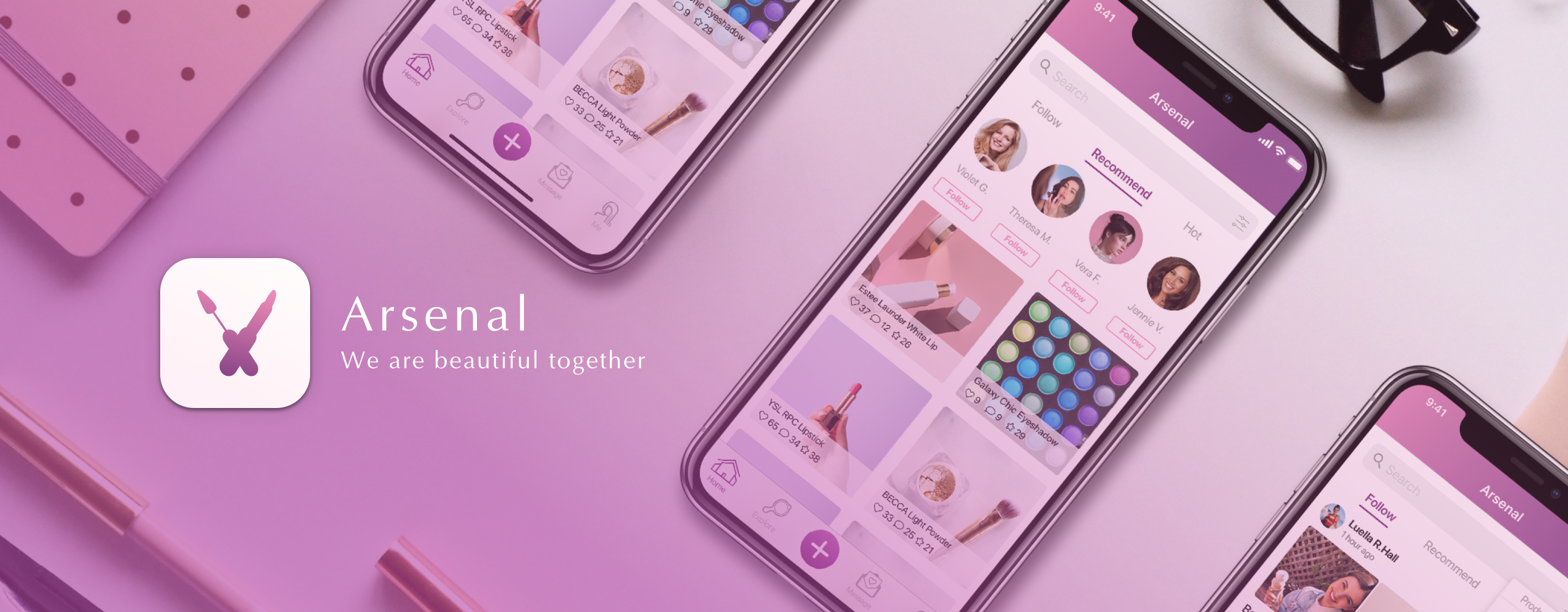
Arsenal is a mobile application for users (mainly young female users between 15 and 30) to learn and share beauty product through social network.
Through Arsenal App, Every user can recommend a product, or ask a question of skin problem, product selection, etc. More importantly, user can purchase a product thorough friend’s recommendation post.
My role:
Research Participant, Interaction & Visual Design Lead,
I worked close with researchers and led team of 10 designers creating multiple iterations of wireframes, middle to high fidelity user interface and prototype.
Project Duration:
1 Month
DISCOVER
Cosmetic Market Overview
USABILITY TEST
We have found there are market opportunities for cosmetics application. Why does users have difficulties to purchase beauty products? Our client comes to us with Arsenal prototype. To validate how the product idea and key functions work, we conducted the usability test on mobile and laptops, in person and remotely, and followed up with in-depth interviews. We continued the testing until we found user problems became repetitive. In total nine users participated in the usability tests.
We encouraged everybody to “Think Loud” so we get to know the problems clearer.
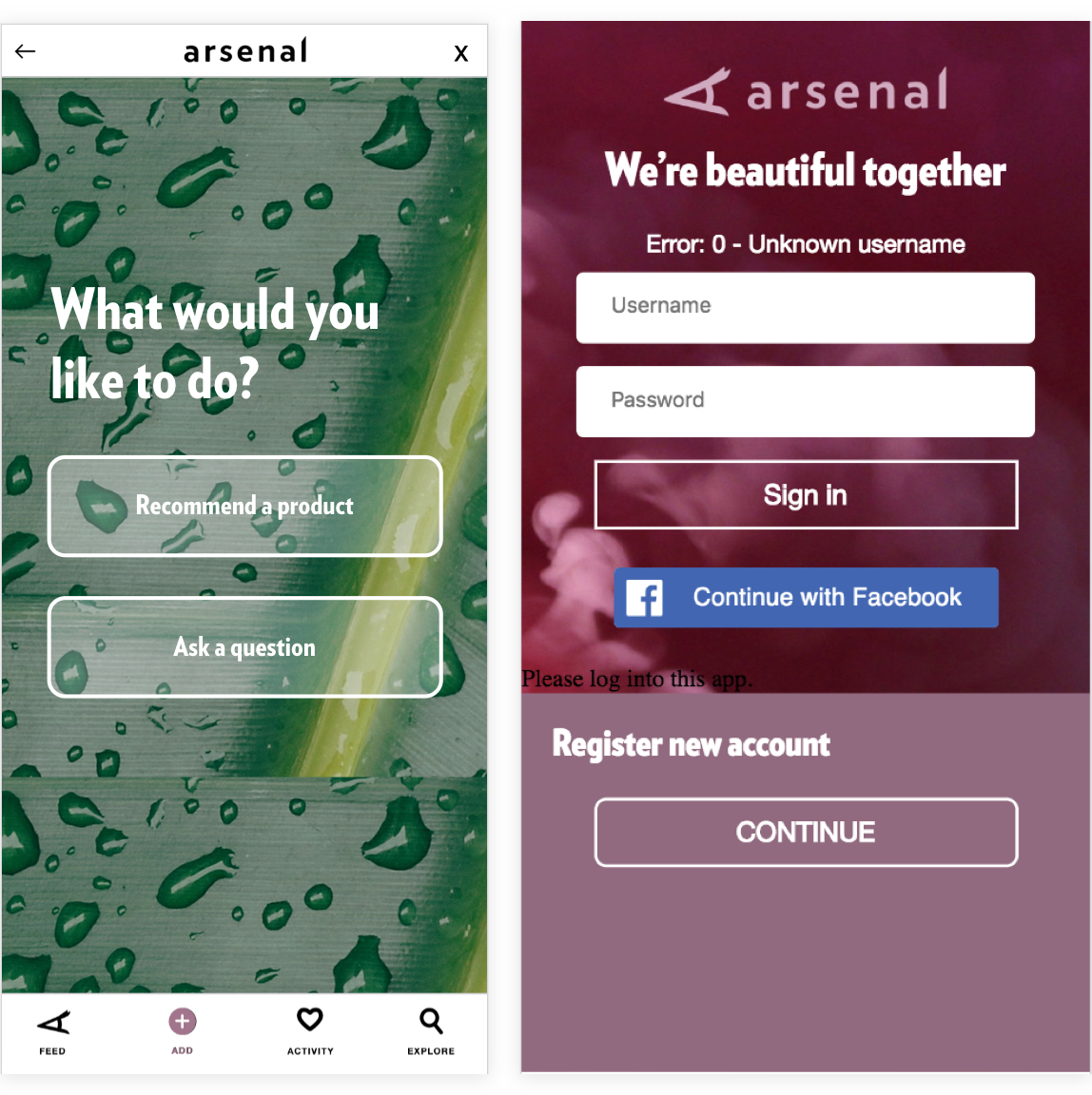
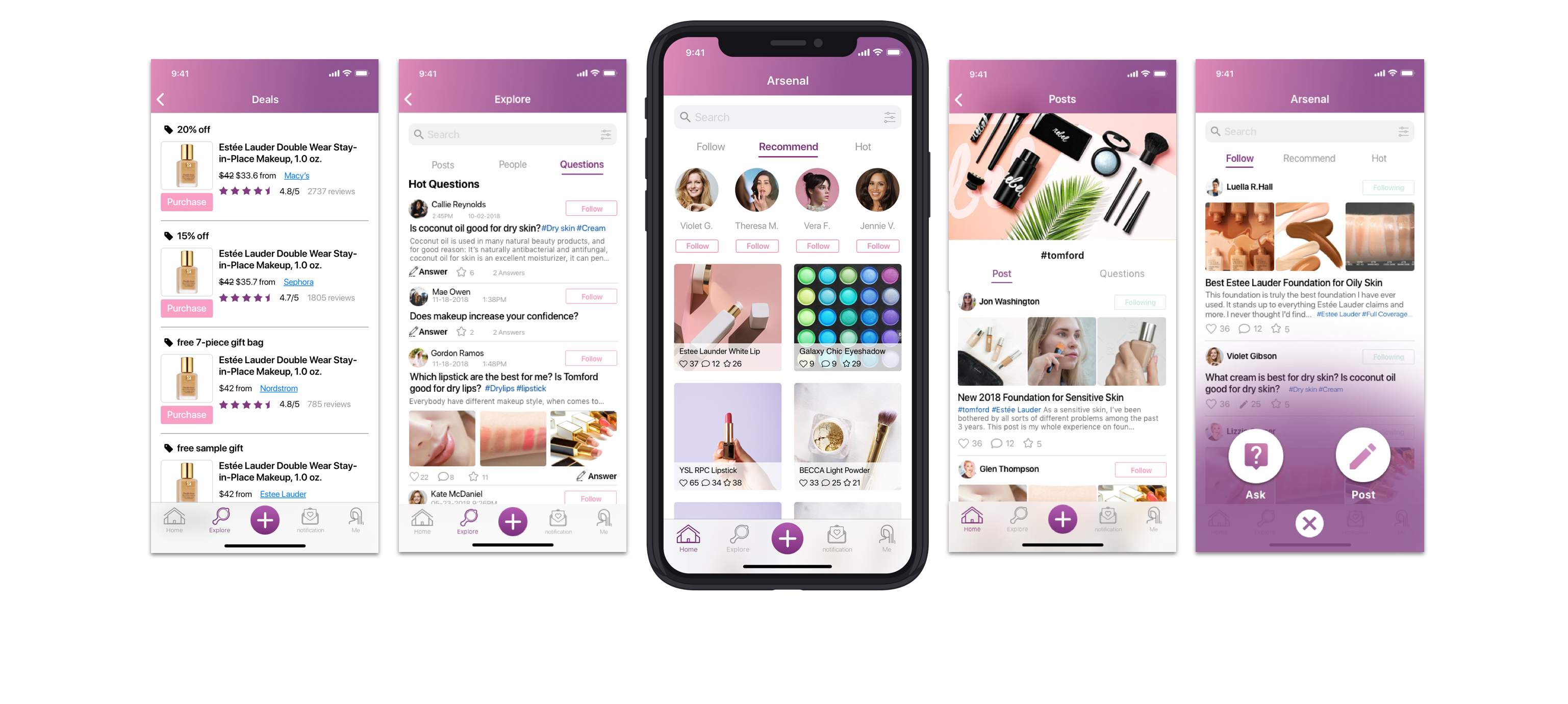
The orginal look of Arsenal
TASK ONE: Register/ edit profile
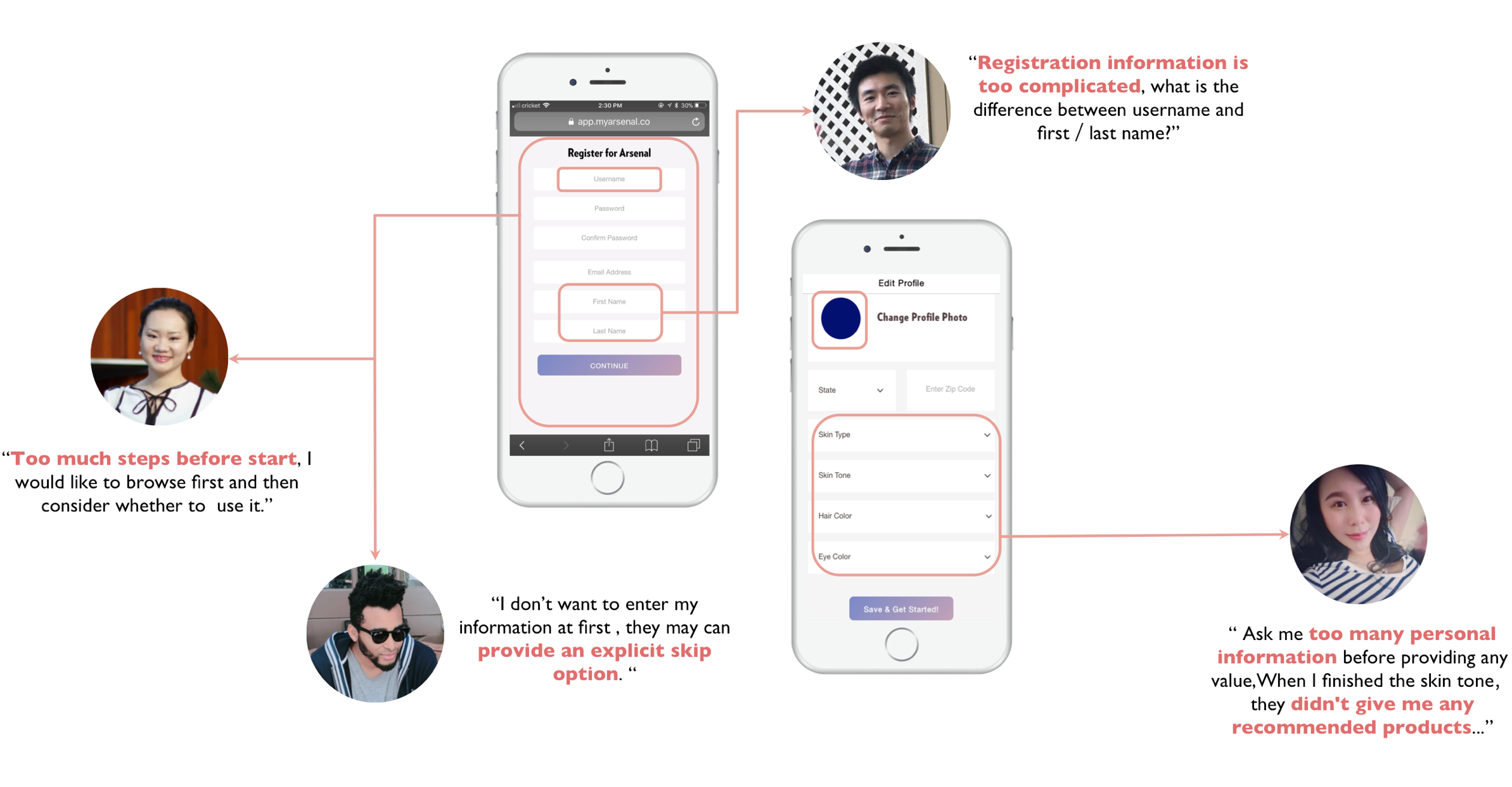
For interface like login/register, profile editing, design should follow the rule of “Moderate conservative”: Don’t try to attract users with innovative design on those existing paradigms. Make it simple, clear and straightforward.
It takes time for first-time users to trust your platform and “scarify” their privacy. So give more rather than asking for more private info from first-time users. (Like the “free trial” period, Let first-time users see some information before they decide to register. )
You don’t want to lose users after they spend 60 seconds on registration and still haven’t finished. Keep only the most necessary steps and keep others for later.
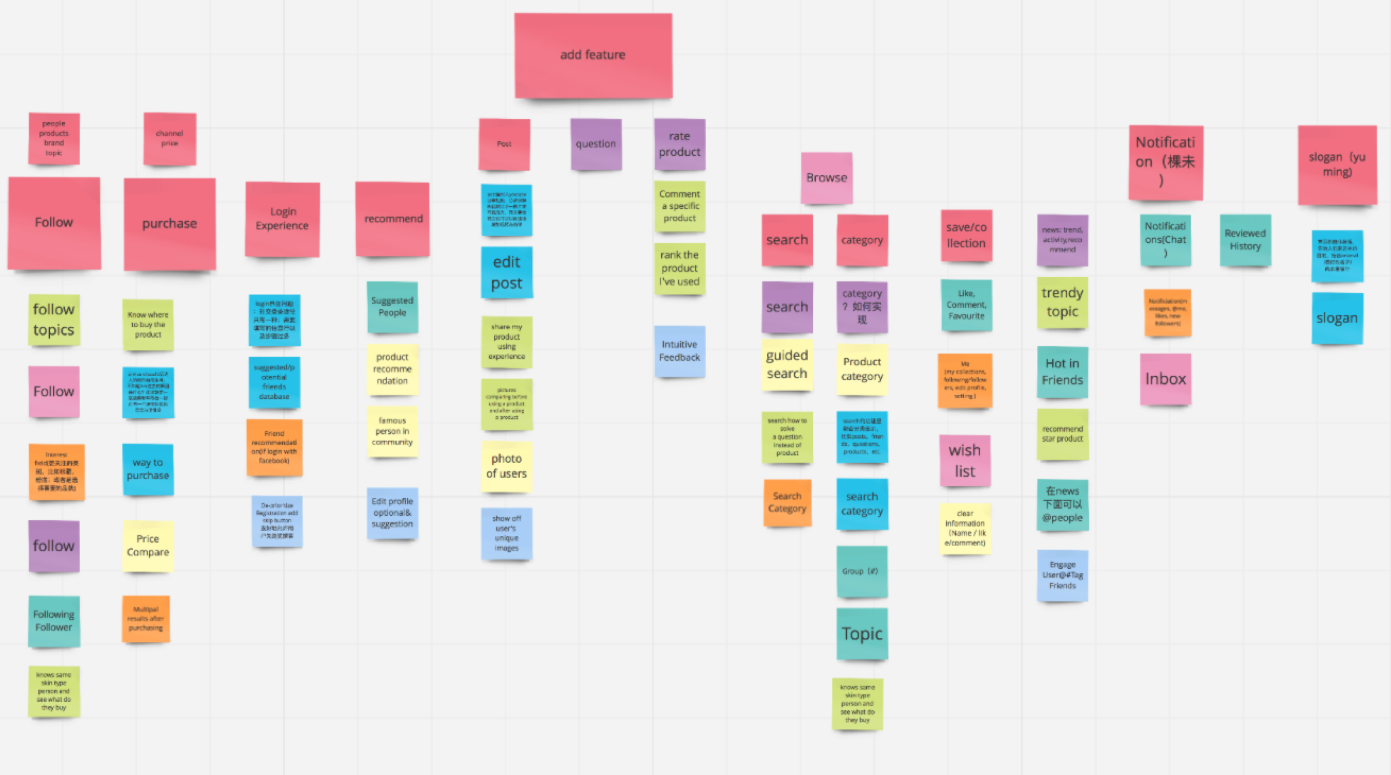
TASK 2: Add a recommend post/ view feed/ activity
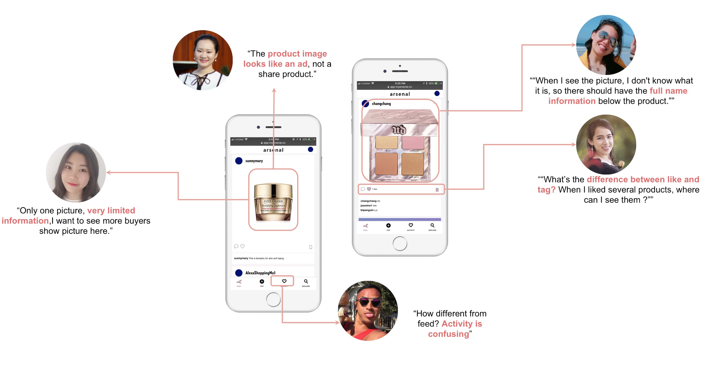
In the current version, user has to recommend from existing database. But the nature of recommending is sharing: sharing your own experience, knowledge, helping others and at the same time learning from others.
For beauty products, visuals are very important. The product should encourage users to add video or pictures in
their recommending posts.
For beauty product, especially make-up, giving the product name and brand is not enough. Users have to know more details, such as the color code that match their skin type/tone, to make purchase decision.
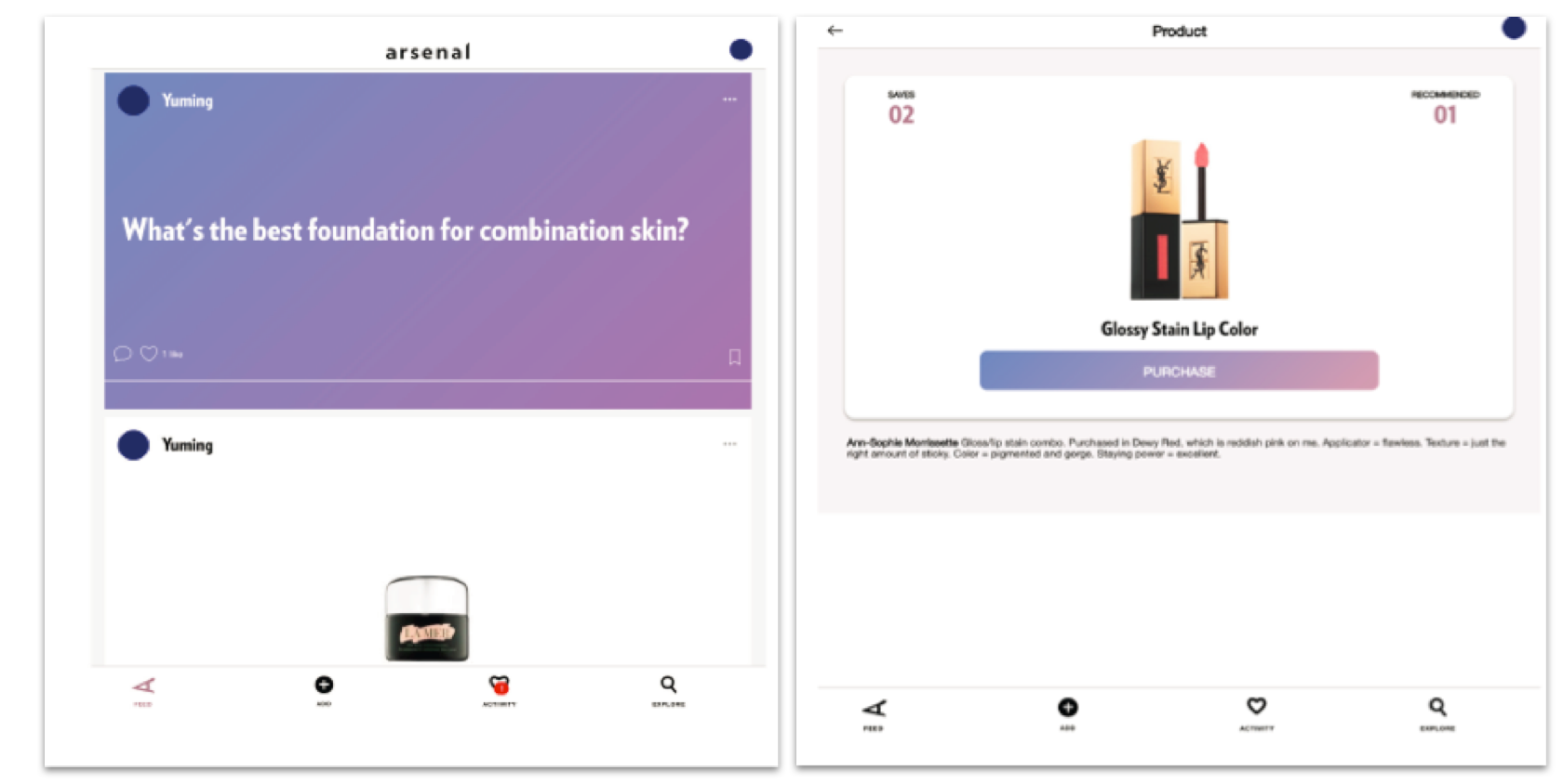
TASK 3 & 4: Add a question post + Purchase
Right now, search/explore is too general, everything mixed together. So the learning cost is too high on the user’s side. We need to add categorization feature for questions and also for recommendation posts.
Users have their own purchase preference, some prefer multi-brand online retailers, some prefer cosmetic company. We cannot force users to buy one product through our selected channel. We need to provide reasons for the selection, or, provide multiple channels based on certain criteria, such as price, where users can choose from.
DEFINE
Real User Issues & Research Questions Revisit
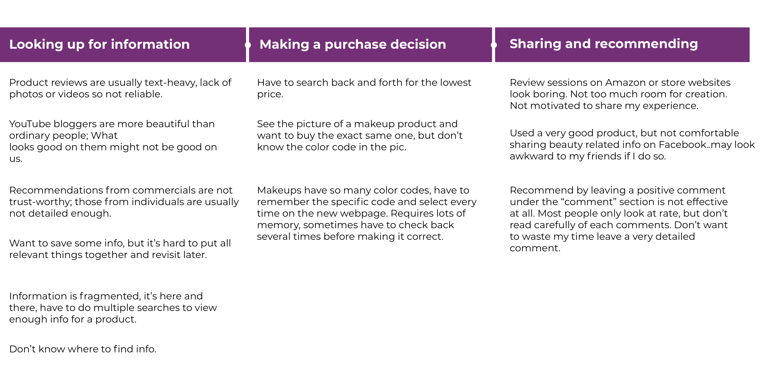
What beneath those usability “problems”?
Usability complains from users are typically indications of deeper issues rather than the root cause. The job of UX research is to look beyond the symptoms and determine the underlying nature of the disease.
The findings from usability test is helpful, but simply fixing those issues are not enough to deliver a real good product. In fact, problems emerged from testing indicated some fundamental user issues that have not yet been covered by research.
With this in mind, we need to answer the following questions of user behavior before next step of redesign:
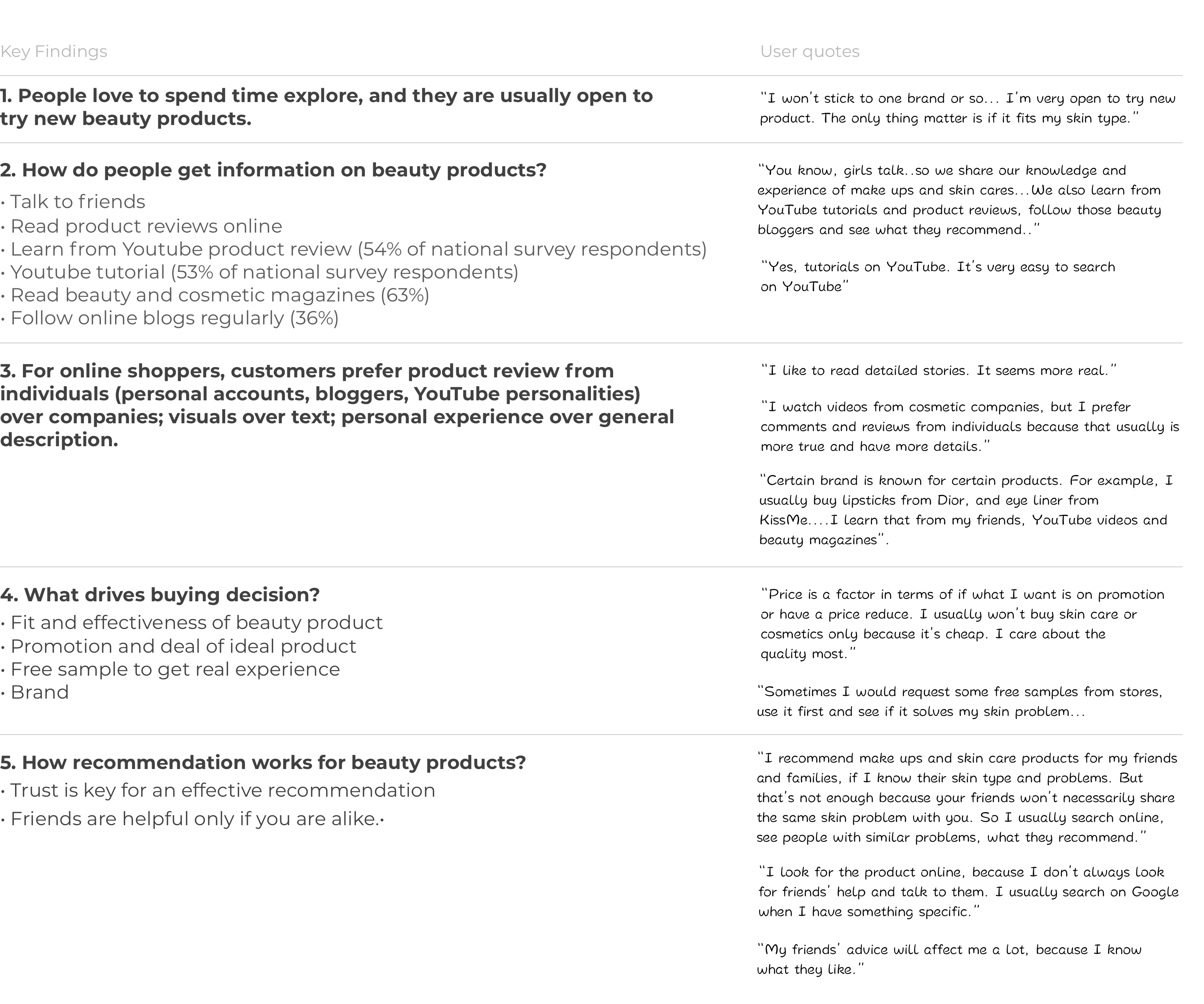
- How does user get information on beauty product/ beauty related problems?
- What’s the motivation of recommending a product, or asking for recommendation, if any?
- How does user buy beauty product? Specifically, how do they buy online?
INSIGHT FINDING
To get insights for the above questions, we mainly used three research methods: secondary research, interviews, landscape analysis.
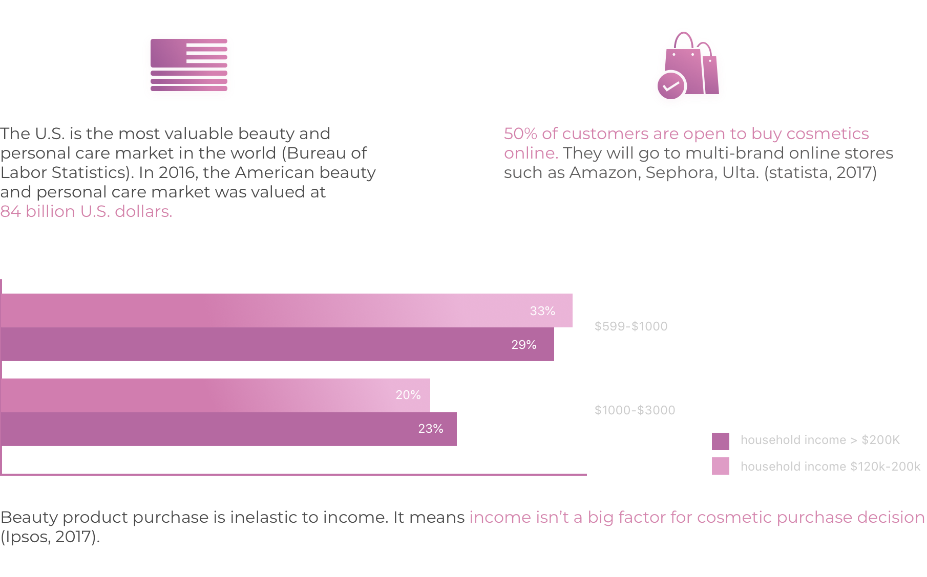
From existing surveys (Statista Surveys, N= 1000+) and interviews (16 female and 8 male),we found: Over 50% would refer to resources online before purchasing, even if they prefer to buy offline
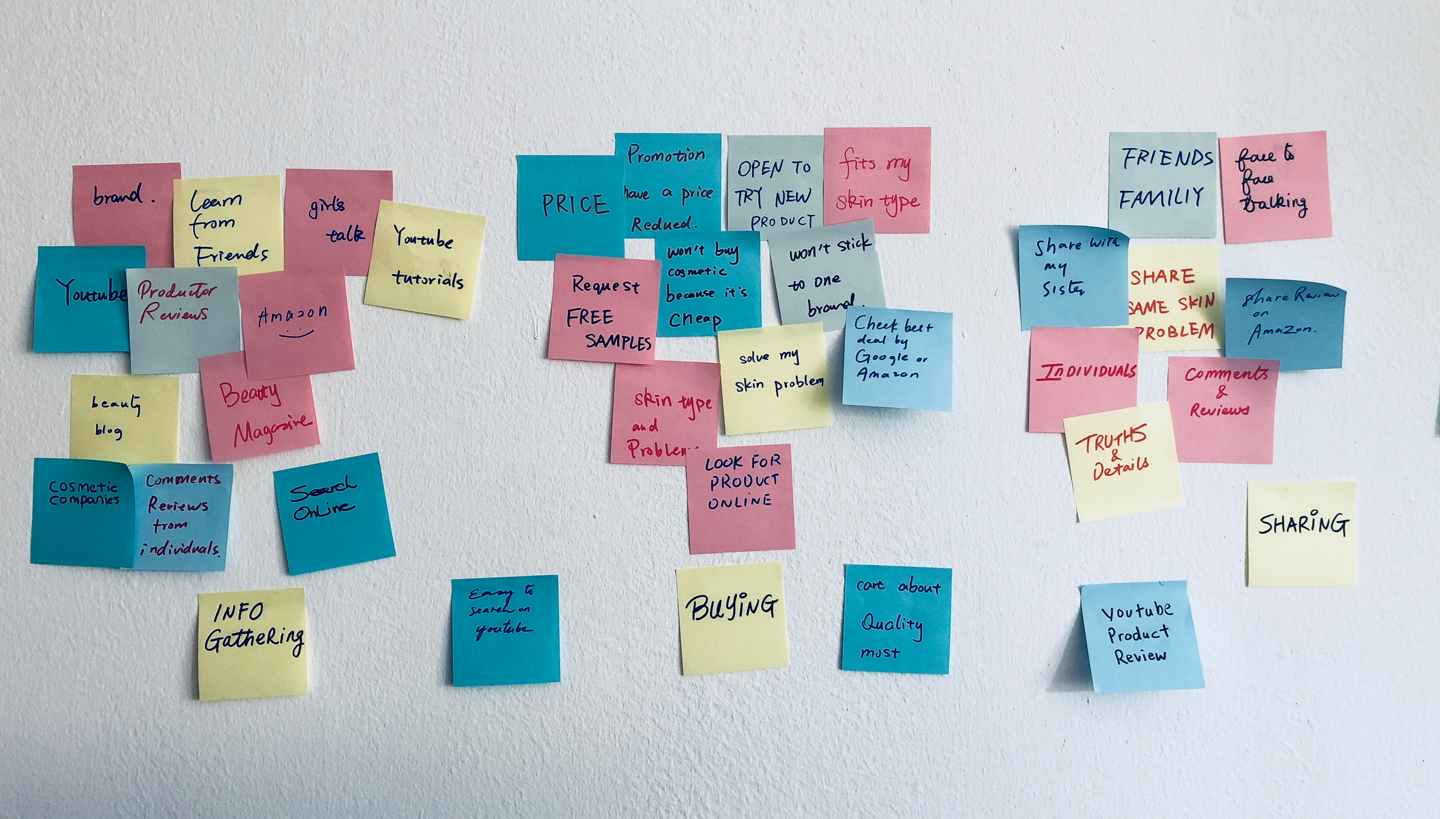
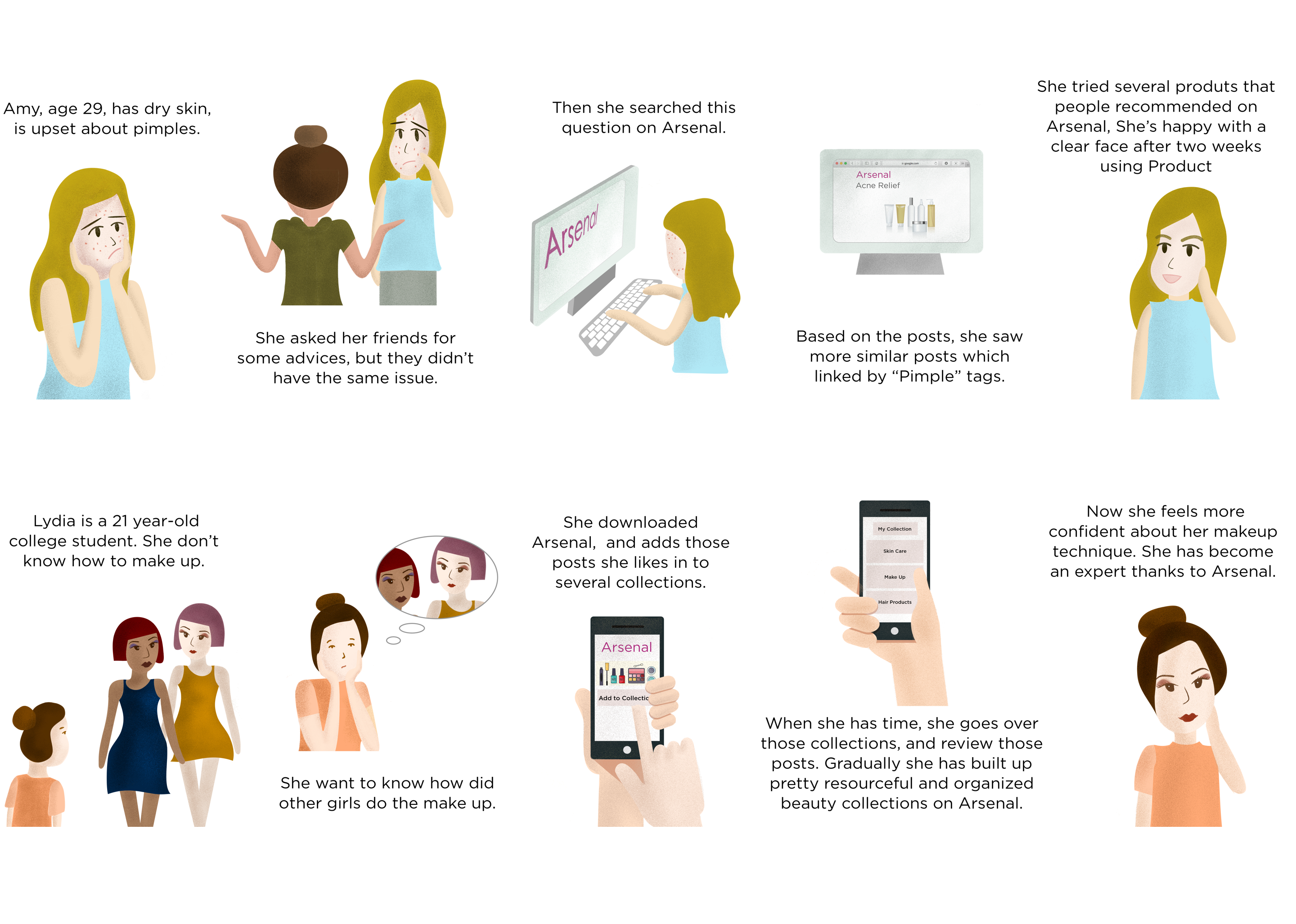
USER JOURNEY
Through in-depth interview, moderated testing and follow-up interviews, I was able to draw a user journey to present users experience and frustrations in the journey of becoming beautiful.
LANDSCAPE ANALYSIS
According to national survey (Statista, 2017), the top three cosmetic online stores are Amazon, Sephara, Ulta. We believe these three existing products reflect a portion of our product’s functions and customer segmentation. Therefore, we did an insight-driven landscape analysis to identify broad values and opportunities for our product.
DESIGN
Synthesized Design Insights
The following insights had been synthesized to shed light on design solution
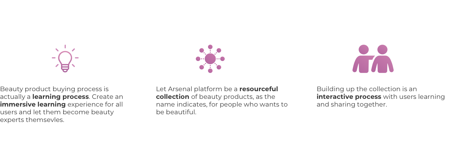
Therefore, the app should add more human elements, emphasize the feature of social experience. What people need is a trusted community where everyone shares true opinions of products they use.